

Three changes move B2B landing page conversion rates faster than anything else: matching the headline to the ad that brought the visitor, cutting form fields to 3 to 5 for gated offers, and placing concise social proof next to the form instead of at the bottom of the page. Message-match headlines typically lift conversion 15 to 30 percent, and trimming form length can add another 10 to 40 percent depending on your starting point. Run one test this week, starting with whichever lever your last audit flagged as weakest.
TL;DR:
- Matching the headline to the ad can increase conversions by 15 to 30 percent, making message match a top priority for B2B landing pages.
- Reducing form fields to three to five significantly boosts conversion rates, especially for demos and gated offers, often nearly doubling success.
- Placing specific social proof next to the form increases trust more effectively than generic testimonials or logos lower on the page.
- Speeding up mobile load times to under 2.5 seconds can improve conversions by up to 7 percent per second shaved, making technical fixes critical.
- Focusing on healthcare, security, and compliance signals delivered near the form reduces hesitation among enterprise buyers, resulting in higher submission rates.
Table of Contents
- What Belongs on a B2B Landing Page: A Prioritized Checklist
- What Do High-Converting B2B Landing Pages Actually Look Like?
- What Is a Good B2B Landing Page Conversion Rate in 2026?
- How Many Form Fields Should a B2B Landing Page Have?
- Which A/B Tests Should You Run First on a B2B Landing Page?
- Why Mobile Speed Is Where Most B2B Pages Lose Leads
- Which Trust Signals Actually Reduce Enterprise Buyer Hesitation?
- A 30/60/90-Day Plan to Fix Your Landing Pages
- How an Enterprise-First, Data-Driven Approach Improves CRO
- Why Enterprise CRO Isn’t the Same Game as SMB CRO
- Get Execution Help on Enterprise Landing Pages and Campaign Measurement
- Sources
- FAQ
What Belongs on a B2B Landing Page: A Prioritized Checklist
Before you touch design, run the 5-second clarity test. Show the page to someone unfamiliar with your product for five seconds, then ask three questions: What do you do? Who is it for? What happens if I click the button? If they can’t answer all three, the headline and subheadline are doing the wrong job, no matter how polished the layout looks.
Message match matters more on B2B pages than almost anywhere else, because enterprise buyers arrive skeptical and comparing you against two or three competitors in open tabs. A landing page that echoes the exact promise made in the ad or email earns a few extra seconds of attention. One that doesn’t gets closed. This is also why running four distinct landing pages by campaign intent, brand, competitor, product, and problem, consistently outperforms sending every paid click to one generic homepage.
Once clarity is solved, audit these five areas in order:
- CTA dominance: one primary call to action above the fold, in a color that contrasts with everything else on the page. Secondary links (pricing, resources, case studies) can wait below the fold.
- Navigation removal: dedicated campaign landing pages should not carry your global site navigation. Every exit link is a leak in a page you paid to fill with traffic.
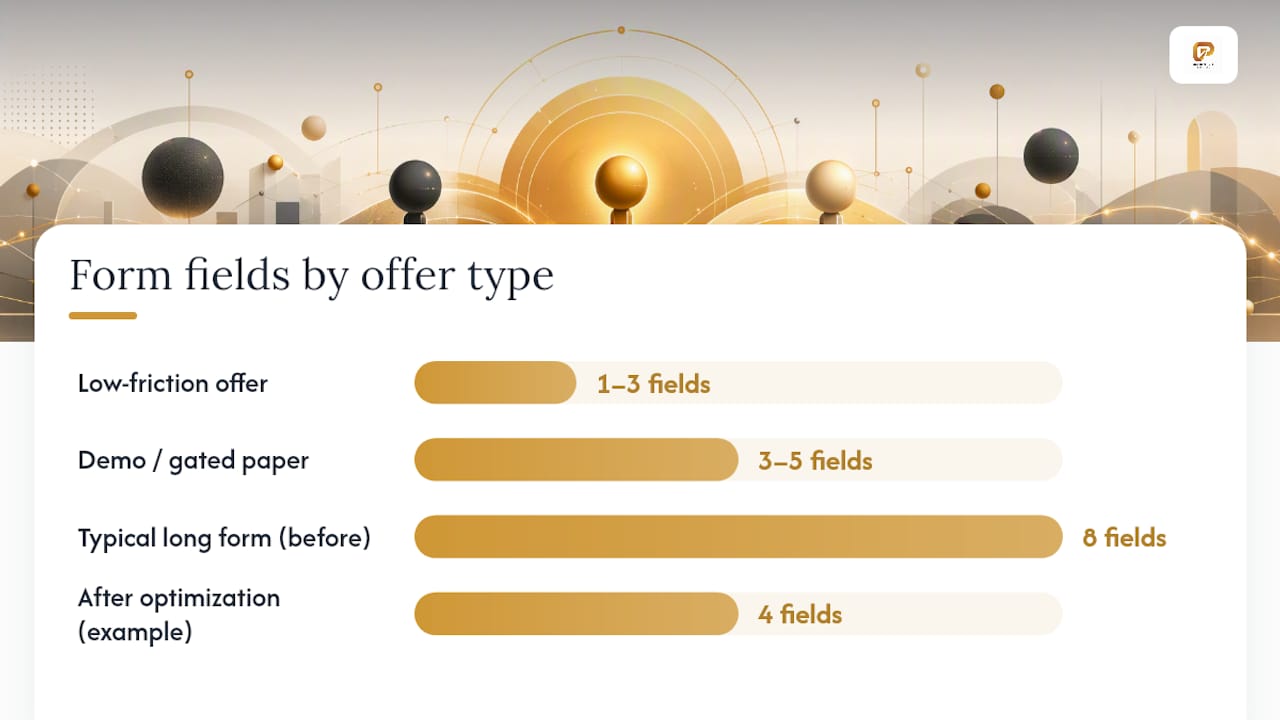
- Form length by offer type: demo requests and gated whitepapers should ask for 3 to 5 fields. Low-friction offers, like a newsletter signup or a free calculator, should ask for 1 to 3. Anything you need beyond that (company size, tech stack, budget) can be captured later through enrichment tools, not extracted from the visitor up front.
- Named social proof above the fold: a logo bar is fine, but a named customer with one measurable result (“cut onboarding time by 40 percent”) does more work than five anonymous five-star icons. Place it directly next to the form, not in a testimonials section three scrolls down.
- Real product visuals: for complex B2B tools, a screenshot of the actual interface builds more trust than an abstract illustration of people pointing at a whiteboard. Buyers are evaluating whether the product looks like something their team can actually use.
Pro Tip: If you can only fix one thing this quarter, fix the form. A field count that drops from 8 to 4 has repeatedly roughly doubled completion rates in aggregated 2026 testing data, and it’s usually a one-afternoon change with no design rework required.
What Do High-Converting B2B Landing Pages Actually Look Like?
Three patterns cover most B2B lead generation use cases. Copying the structure, not just the aesthetic, is what makes these effective.
1. Demo request pages. The hero leads with an outcome, not a feature list, something like “Cut invoice processing time from 6 days to 6 hours,” paired with a 4-field form (name, work email, company, phone) and a named-customer quote sitting directly beside it. This works because demo requests are a high-commitment ask. The visitor needs a concrete reason to believe the outcome before they’ll hand over a phone number, and a vague headline plus a generic “Request a Demo” button gives them nothing to anchor that belief to.
2. Free trial and self-serve signup pages. These convert best with an actual product screenshot above the fold, ideally an interactive one, and the shortest possible form, often just an email address. Microcopy like “No credit card required” or “Live in under 10 minutes” removes the two biggest hesitations self-serve buyers have. The goal here is momentum, not qualification; you can qualify inside the product with usage data.
3. Making the buyer wait for a follow-up email to get a PDF they already agreed to trade their information for is a common, fixable friction point.
How you adapt these by traffic source matters as much as the pattern itself:
- Paid search traffic arrives with high intent and low patience. Match the headline to the exact keyword or ad copy, and keep the form short.
- LinkedIn traffic arrives colder and more skeptical of ads. Lead with a named-customer proof point before asking for anything, and expect a lower initial conversion rate that a good sales follow-up sequence can offset.
- Email traffic already trusts you somewhat. You can ask for slightly more form detail here than you would on cold paid traffic, since the visitor already opted in once.
What Is a Good B2B Landing Page Conversion Rate in 2026?
The median B2B lead-generation landing page converts at roughly 4.1 percent, with the top quartile reaching 7.0 percent and the top 10 percent of pages hitting 11.2 percent. Free trial and self-serve B2B SaaS pages run a wider range, 2 to 5 percent typical, with top performers reaching 8 to 15 percent, largely because “top performer” status often depends more on traffic quality than page design alone.
By the numbers: Form length is the single clearest driver in the benchmark data. Pages with 3 to 4 fields convert at a median of 5.2 percent. Pages with 5 to 7 fields drop to 3.4 percent. Pages with 8 or more fields fall to 1.9 percent, according to CorePPC’s 2026 benchmark analysis.
That gap alone explains why so many “redesign” projects fail to move the needle: teams rebuild the hero section and leave the ten-field form untouched.
A realistic short-term target is beating your own historical median by 20 percent, not chasing the top-decile number from a benchmark report you don’t have the traffic volume to replicate reliably. Set the target against your own baseline first.
Track these KPIs together, not in isolation, since a landing page win that doesn’t survive contact with sales isn’t actually a win:
- Visitor-to-lead rate (the landing page CVR itself)
- Lead-to-MQL rate (are the leads you’re generating actually qualified?)
- MQL-to-SQL rate (is sales accepting what marketing sends?)
- SQL-to-opportunity rate (does the lead quality hold up in a real sales conversation?)
If visitor-to-lead climbs but MQL-to-SQL craters, you didn’t optimize the page. You just made it easier to submit junk.
How Many Form Fields Should a B2B Landing Page Have?
The right field count depends entirely on where the offer sits in the funnel, not on a single universal rule.

Top-of-funnel offers (ebooks, checklists, webinar registrations) should ask for name, work email, and company. That’s it. Anything else can be inferred or gathered later.
Middle-of-funnel offers (demo requests, product tours, ROI calculators) can reasonably ask for 4 to 5 fields: name, work email, company, phone, and maybe company size or role. The visitor has shown enough intent to justify a slightly higher ask.
Bottom-of-funnel offers (pricing requests, consultations, contract inquiries) can justify longer forms, sometimes 6 to 8 fields, because the visitor is close enough to a buying decision that friction matters less than qualification detail.
Everything you don’t ask for on the form, you get afterward. Progressive profiling, showing a returning visitor a slightly different, shorter form that asks for new information instead of re-asking what you already have, works well when paired with post-submit enrichment tools that fill in company size, industry, and tech stack from the email domain alone. This lets the form stay short while your CRM record still ends up complete.
A few smaller details matter more on mobile than desktop. Use the correct input type for each field (type="email", type="tel") so the right keyboard appears automatically, and keep tap targets large enough that a thumb doesn’t miss.
Pro Tip: Add one line of microcopy under the submit button stating your privacy stance and response time, something like “We respond within one business day. No spam, ever.” Reducing this kind of uncertainty often moves conversion more than any visual redesign, particularly for enterprise buyers weighing whether a form submission triggers a barrage of calls.
Which A/B Tests Should You Run First on a B2B Landing Page?
Run tests in order of expected impact, not in order of what’s easiest to build. Message match and form length consistently produce the largest single-test lifts, according to aggregated 2026 A/B testing data across CorePPC, GrowthSpree, and Acceleroi, so they belong at the top of your queue even if a CTA color swap feels faster to ship.
- Headline and message match against the referring ad or email subject line.
- Form field count, testing your current form against a 3 to 5 field version.
- Social proof placement, testing proof next to the form versus proof lower on the page.
- CTA copy, testing an outcome-focused phrase (“See Your ROI in 15 Minutes”) against a generic one (“Get Started”).
- Page speed, since load time interacts with every other variable above it.
Testing discipline matters as much as the queue order. Change one variable per test. Don’t run a headline test and a form test simultaneously on the same page unless you’re using a proper multivariate setup, and even then, most B2B traffic volumes are too low to support it cleanly. For sample size, a rough working rule for B2B traffic levels is to wait until each variant has accumulated at least 100 conversions before calling a winner. At B2B traffic volumes, that often means running a test for 3 to 4 weeks, not 3 to 4 days, no matter how tempting it is to call it early. This kind of systems-first approach to test sequencing is covered well in Monstrous Media Group’s guide to landing page testing.
Once you have a lift percentage, translate it into cost-per-lead terms your finance team actually cares about:
A winning variant that clears your sample-size threshold with a clean, single-variable test should roll out site-wide immediately on comparable pages. A result that’s directionally positive but hasn’t hit statistical confidence should get one more testing cycle before you touch anything else on the page.
Why Mobile Speed Is Where Most B2B Pages Lose Leads
Mobile sessions now make up the majority of traffic to most B2B landing pages, even for offers that ultimately get evaluated on a desktop later. A page that loads slowly or breaks on a phone loses the visitor before the headline ever gets read.
Aggregated 2026 testing data shows conversion improving 5 to 7 percent for every second of load time shaved off a landing page, making speed one of the highest-leverage technical fixes available.
Run a Core Web Vitals check through Google PageSpeed Insights on every campaign page before launch, not after. Target a load time under 2.5 seconds, and treat anything over 3 seconds as an urgent fix, not a backlog item.
The usual culprits are predictable:
- Autoplay hero videos that load a multi-megabyte file before anything else renders
- Unoptimized logo and screenshot images exported at print resolution instead of web resolution
- Synchronous third-party scripts (chat widgets, tracking pixels) that block the page from rendering until they finish loading
On mobile UX specifically, stick to a single-column layout, keep the CTA button sticky at the bottom of the screen rather than making visitors scroll back up to find it, and make every tappable element at least 48 pixels tall. Once you’ve shipped a mobile fix, segment your A/B test results by device. A win on desktop and a loss on mobile average out to nothing in your overall numbers, but they’re two completely different problems.
Which Trust Signals Actually Reduce Enterprise Buyer Hesitation?
Enterprise buyers aren’t primarily worried about whether your product works. They’re worried about whether buying it will blow up their week if something goes wrong. That anxiety, more than any cosmetic design choice, is usually the biggest thing standing between a visitor and a submitted form on a complex B2B page.
The signals that actually move the needle:
- Named-customer claims with a specific number (“Reduced deployment time 60% for a Fortune 500 logistics team”) outperform vague claims like “Trusted by industry leaders” by a wide margin.
- Quantified case-study metrics placed near the final CTA, not just buried in a resources section.
- Security and compliance certifications (SOC 2, HIPAA, GDPR readiness) shown near the form itself, since this is exactly where hesitation peaks for regulated-industry buyers.
Placement hierarchy matters here: logo bar in the hero for quick credibility, a specific testimonial directly beside the form where the visitor is actively deciding, and case-study links right before the final CTA for anyone who scrolled the whole page without converting. Avoid generic review badges with no context. A star rating with no named source or sample size reads as filler, and buyers evaluating enterprise software notice the difference immediately.
A 30/60/90-Day Plan to Fix Your Landing Pages
Start with a day-zero audit: run the 5-second clarity test, count your form fields, and check your PageSpeed score on every active campaign landing page. Rank pages by traffic volume, since that’s where a fix pays off fastest.
- Days 1 to 30: Ship the quick wins, message-match headline edits, form field reduction, moving social proof next to the form, and launch your first two or three priority A/B tests.
- Days 31 to 60: Let those tests reach statistical confidence, implement page-speed fixes (image compression, script deferral), and start a mobile-specific redesign if your device-segmented data shows a real gap.
- Days 61 to 90: Roll winning variants out to comparable pages across the account, measure the change in pipeline outcomes, not just landing page CVR, and expand the testing program to secondary campaigns and offer types.
How an Enterprise-First, Data-Driven Approach Improves CRO
Enterprise landing pages carry more technical and organizational complexity than most CRO advice accounts for. A conversion win on a page that’s disconnected from CRM data or built on top of an unstable legacy stack doesn’t survive contact with a sales team that can’t act on it.
Golden Path Digital built its approach around this exact problem. Before recommending a single design or copy change, the team maps dependencies across your CRM, marketing automation, and underlying systems, the same structured, dependency-first methodology behind flagship tools like AS/Forward for legacy codebase analysis and Laravel Ascend for framework upgrades. Applied to conversion work, that means understanding how a lead actually flows from form submission through your automation platform before touching the page itself.
This matters because enterprise buyers respond to signals like security certifications and clear compliance posture more than surface-level design polish, echoing the Conversion Sequence Heuristic’s emphasis on reducing anxiety over cosmetic persuasion. Practically, that shows up as:
- Auditing existing CRM and workflow automation integrations before recommending any landing page rebuild
- Publishing client wins with specific, verifiable metrics, conversion rate before and after, CPL change, pipeline impact, rather than vague testimonial language
- Prioritizing HIPAA-compliant and privacy-conscious system integration for regulated-industry clients where trust signals carry outsized weight
Why Enterprise CRO Isn’t the Same Game as SMB CRO
Most CRO advice implicitly assumes a single decision-maker clicking a button. Enterprise B2B rarely works that way. A form fill is the start of a multi-stakeholder buying process, so the highest-leverage move often isn’t a headline tweak but making sure sales gets a clean handoff with context intact.
That reframes the job: align analytics, sales SLAs, and offline conversion routing before chasing another half-point of CVR. Track pipeline impact, not just form fills, since a spike in cheap leads that sales can’t close is a vanity win dressed up as a real one.
— Ty
Get Execution Help on Enterprise Landing Pages and Campaign Measurement
Reading a benchmark table is one thing. Rebuilding a campaign account around it while your CRM, ad platforms, and legacy systems all need to stay in sync is another. Managed PPC and enterprise CRO services can help run prioritized tests like those outlined here, while ensuring conversion tracking is correctly wired to your CRM and workflow automation.

The typical outcome isn’t just a better-looking page. It’s a measurable drop in cost per lead, tied to conversion tracking that reports pipeline impact your sales team can act on instead of a vanity CVR number marketing can’t defend in a pipeline review. That clarity depends on the same dependency-mapping discipline Golden Path Digital applies to legacy code modernization work, understanding every system a lead touches before changing any of them.
If your landing page results have plateaued or your sales team keeps flagging lead quality issues, reach out through Golden Path Digital to scope a conversion and tracking audit for your account.
Sources
- Landing Page Conversion Rate Benchmarks by Industry (2026) | COREPPC
- B2B SaaS Landing Page Benchmarks & Conversion 2026
- B2B SaaS Landing Page Benchmarks & Conversion Rates 2026
- Lead Gen Landing Page Optimization: Benchmarks and Tactics | acceleroi
FAQ
What Is Landing Page Optimization in a B2B Context?
It’s the process of systematically improving a page’s headline, form, proof points, and load speed to convert more qualified visitors into leads, measured against benchmarks like the 4.1 percent B2B median CVR rather than guesswork.
What Is the Rule of 7 in B2B?
The rule of 7 holds that a prospect typically needs around seven touchpoints with your brand before taking action, which is why a landing page shouldn’t be judged solely on first-visit conversion. It also needs to reinforce the same message a visitor has already seen in ads, emails, or LinkedIn content.
What Are the Best Practices for Optimizing Landing Pages?
The highest-impact practices are message-match headlines, forms trimmed to 3 to 5 fields for demo and gated offers, named social proof placed next to the form, and page load times under 2.5 seconds, in roughly that order of impact.
Does SEO Work for B2B Landing Pages?
SEO can drive qualified traffic to gated-asset and problem-focused landing pages, but dedicated campaign pages built for paid traffic usually skip heavy SEO structure in favor of conversion focus. Pairing buyer-role-mapped content with organic landing pages works best for top-of-funnel offers rather than bottom-of-funnel demo requests.
How Do I Know If My B2B Landing Page Conversion Rate Is Good?
Compare it against your own historical baseline first, then against the 4.1 percent median for lead-gen offers or the 2 to 5 percent range typical for B2B SaaS free trial pages. A short-term target of beating your own median by 20 percent is more actionable than chasing a top-decile benchmark from a different traffic mix.